Powerpoint, Biorender and AI
This illuminating tweet from Michael Baym on how restrictive the biorender license is reminded me of a little post I’d meant to write.
You’ve probably noticed a profileration of Biorender images in talks, papers, grants and especially graphical abstracts you’ve seen in recent years.
I think I’ve seen these really increasing in prevalance over the past couple of years, maybe because of institutional subscriptions, maybe because we have been seeing increasing numbers of our peers using it and don’t want to be left out.
No doubt, the quality of these figures is typically pretty good. I think in cellular biology they definitely have some nice little icons, although when you get towards genomics it does feel like sometimes there’s a bit of an overuse of HiSeq and 96-well plate logos (perhaps we don’t typically have much more in the way of experimental design).
But my gut tells me that while biorender is raising the mean quality of figures, it is also lowering the variance. Much like powerpoint has done for our presentations over the past few decades, and perhaps like AI-generated images are going to do for scientists. Everything is slightly better, but more homogeneous.
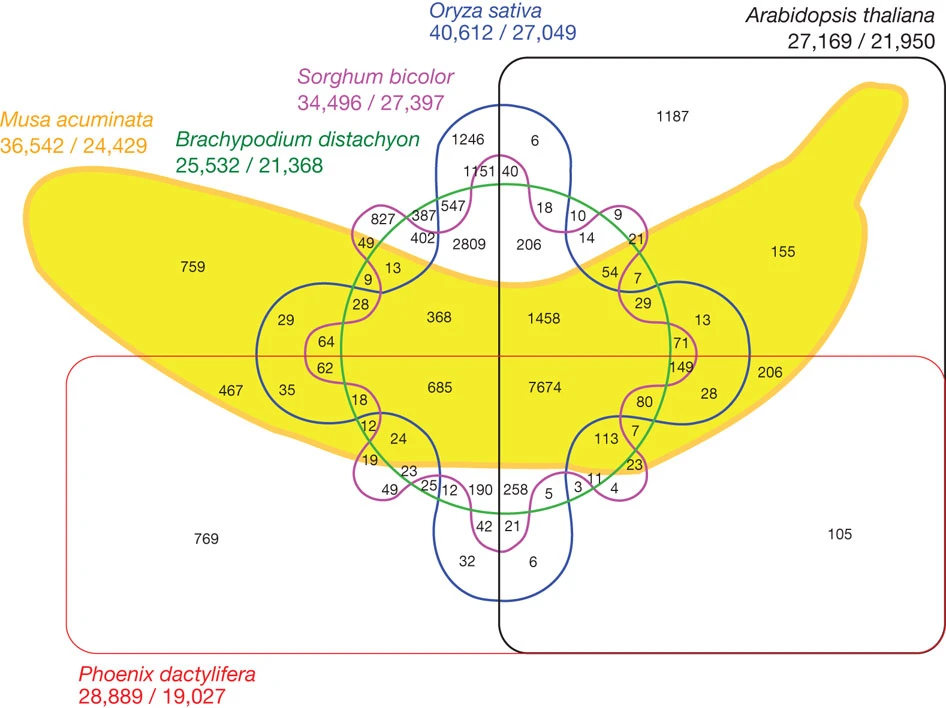
Maybe next time you are thinking of using biorender (or powerpoint, or DALL-E) have a go at making it the old fashioned way. Otherwise we’d lose bangers like these:


Many more here.